MLS Jersey Rankings: Which Team Will Have the Top Design in 2026?
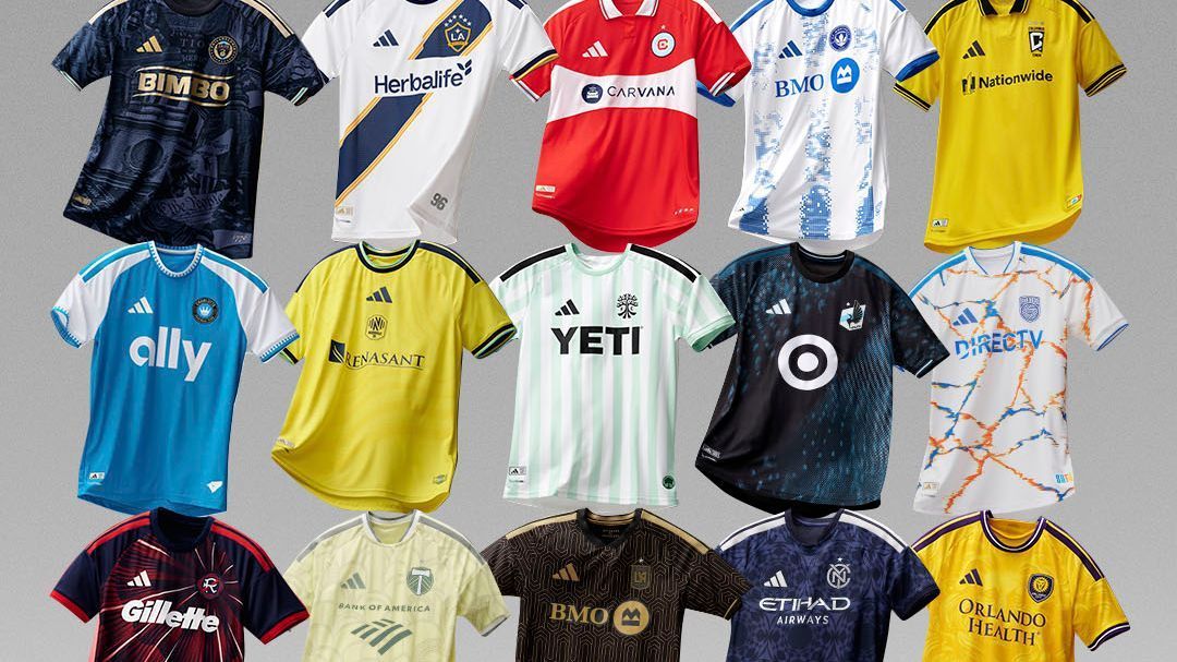
A new season of MLS is approaching, which means all 30 teams will debut fresh kits from Adidas. The era of template designs dominating the league and limiting creativity has passed (at least for the moment), and each club has received a custom design that showcases a variety of styles across the two nations.
While some teams are really pushing the boundaries of inspiration for these kits — and it’s understandable, given the annual challenge of creating a new one and claiming it has significant local meaning when sometimes they simply opted for a design they found appealing — others have tapped into genuinely delightful sources of inspiration. Ultimately, it boils down to whether the design is visually appealing.
So which kits are successful, and which clubs fell short? As each team reveals its new uniform, we will rank them!
1. New England Revolution
Welcome back, 1996! The team that has rightfully retained its name from the inaugural MLS season now sports a kit that feels reminiscent of the bold and unique years of the league’s inception, which is fantastic.
The club asserts that it is honoring the nation’s founding in 1776, coinciding with the 250th anniversary of the United States, but this is the New England Revolution. They are the MS Paint crest. They are the militia firing muskets after goals. They epitomize the year MLS was established and the transformation of American soccer. This kit, featuring its red, white, and blue starburst design, embodies that spirit.
2. LAFC
LAFC has oscillated between attempting to make black and gold stand out on their own, which has often been underwhelming, and embracing the art deco aesthetic of their brand, which is stunning. This time, they opted for the latter, resulting in one of their finest kits to date.
This is how to be daring while anchoring your design in the elements that have been part of your identity from the beginning, distinguishing yourself from others in the league. This design is beautiful, rooted in Los Angeles, and unmistakably LAFC. It’s ideal.
3. San Jose Earthquakes
The Grateful Dead may be mainly linked with San Francisco, but they originated just up the road from San Jose in Palo Alto, and this is an excellent kit that pays tribute to that legendary Bay Area band. The tie-dye pattern is unconventional for a soccer jersey, yet it doesn’t appear absurd or inappropriate, and the Quakes’ blue and black on a white background ensures it still represents the club. It’s impressive, and perhaps next year San Jose will experiment with a Scarlet Begonias kit to complete the collection.
4. CF Montréal
Montréal claims this kit is inspired by the uniforms worn by the 2015 squad, a team worth remembering. After all, that Impact team reached the Concacaf Champions League final and defeated Toronto in the MLS Cup playoffs.
This kit bears little resemblance to the jersey that team wore, but it still looks appealing, and the club collaborated with ProCure in the battle against prostate cancer with this kit. Good design, a commendable team, and solid inspiration, however tenuous the latter may be. This is a strong kit.
5. New York City FC
NYCFC has faced challenges in finding the right secondary shirt. Their home kit resembles those of other City Football Group clubs, which increases the pressure to make their alternate look distinctive and uniquely theirs. This has led to garish and bold designs that are forgettable, but this one truly succeeds for the first time.
It’s a subtle shirt — the navy is hardly revolutionary, but the design is beautiful and won’t be mistaken for another club anywhere globally, while the silver stripes and sponsor integrate seamlessly. With the minimalist crest, the Pigeons are set to look sharp.
6. Minnesota United
The Loons are commemorating 10 years in MLS with a nod to their original uniforms. While that first MNUFC jersey featured a blue sash, this one incorporates blue design elements that create a subtle sash using negative space.
It’s a solid design, and it’s refreshing to see them return to the black-and-blue sky theme that was so well-received in their previous northern lights kit. If they continue to revisit this concept, it’s unlikely anyone will complain.
7. LA Galaxy
It’s always challenging for teams that wear white at home to create interesting designs, but the Galaxy’s sash provides them with something distinctive and recognizable. Whenever they embrace the sash, they are doing well, even if the interruption for the sponsor is disappointing; however, the six stars help to balance that out.
8. Orlando City
Orlando has not really ventured into new colors for its kits. The Lions don purple for their primary shirt, and their secondary kits have been either white or a light purple, so adopting this yellowish gold represents a significant shift for the club and is an excellent choice. It’s vibrant and bold without straying too far from their identity, as the purple accents ensure it is recognizable as Orlando City. It also conveys a warm, Florida vibe.
9. San Diego FC
San Diego was burdened with a plain kit during its expansion season last year, so it’s nice to see the club receive a design — any design — this time. Due to its lackluster crest, there was little indication of where it would go with its kits, and the club opted to stick with white. It’s hardly thrilling, and the visual identity of SDFC remains unclear, but the prominent blue and orange make the shirt stand out and at least feel tailored rather than off-the-shelf like in 2025.
10. Austin FC
Austin is aligning vertical stripes on its primary and secondary kits for the first time, and with both shirts being green, it could seem somewhat redundant, but this jersey is distinct enough to create a nice combination.
The pale green and white complement each other well, and the black stripes, logos, and sponsor ensure the kit isn’t too subtle or forgettable. Overall, it’s effective and pairs well with the home shirt without appearing to be merely a color-swapped version of it.
11. Chicago Fire
Chicago’s unfortunate and abandoned rebranding is still fresh in our memories, so any time the club returns to its origins, it’s a significant improvement. Red with a white band across the middle accomplishes the goal. Adding a collar with a nice red stripe and a blue sponsor across the front shows attention to detail.
The Fire have a promising future, with their own stadium set to begin construction later this year, but it must be rooted in the club’s history. This kit achieves that.
12. New York Red Bulls
This isn’t the Red Bulls’ finest design, and the concept behind the roots intended to symbolize the club’s development feels somewhat forced, which means that in isolation, this kit would rank much lower. However, we acknowledge whenever the club opts for MetroStars’ black and red over the Red Bull conglomerate’s white, red, and blue. This kit seems to represent the club rather than the energy drink brand, making it easier to overlook some other aspects.
13. Charlotte FC
Can you believe it’s already Charlotte’s fifth MLS season? The club is returning to basics with this kit, featuring blue on the body and white sleeves, similar to its first two years, which is a wise decision. The Crown has a distinctive color, and the white sleeves enhance its visibility. They might consider incorporating a touch of black in the trim to unify their color palette, but this club is better suited to a home kit that allows their color to shine, and this design, like their inaugural kit, accomplishes that.
14. Columbus Crew
Remember when the Crew attempted to make black their primary color and sidelined yellow? Thankfully, those days are behind us. This kit is straightforward, but simply yellow is more than sufficient for Columbus, and the collar is a nice nod to the early 2000s when it was a common feature on Crew shirts.
15. Philadelphia Union
Whenever the Union don’t feature a vertical stripe, preferably down the center, they have missed the mark. This design isn’t bad, and the navy and gold combination is sharp, but it lacks inspiration. If they intend to continue referencing Ben Franklin and the constitutional convention, they will need to develop better, clearer, and more consistent marks that they can claim as their own instead of just inserting “We The People” randomly when they lack a clear idea.
Above all, though, it doesn’t have a vertical stripe.
16. Nashville SC
Nashville has made it evident in its brief existence that it prefers not to get overly creative with its home kits. The club’s color scheme will remain yellow, and that’s acceptable.
However, NSC doesn’t need to stack the Adidas logo and crest in the center right above the sponsor logo as well. That adds clunky design elements to a kit that was never going to impress anyone. The highlight of this jersey is that Nashville Predators and Nashville SC part-owner Filip Forsberg leaked it when he wore it to a game last week.
17. Portland Timbers
The concept for this kit is commendable. It aims to celebrate the 100th anniversary of Providence Park, a stadium that arguably defines this club more than any other home ground does its MLS team, but the execution falls short.
Instead of resembling the weathered exterior of the revered old venue with ivy growing over it, it appears as a nondescript pale yellow, and without context, it would be challenging to discern what it is intended to represent. It’s unfortunate that the execution did not align with the concept.

